Accessible Target Sizes Cheatsheet
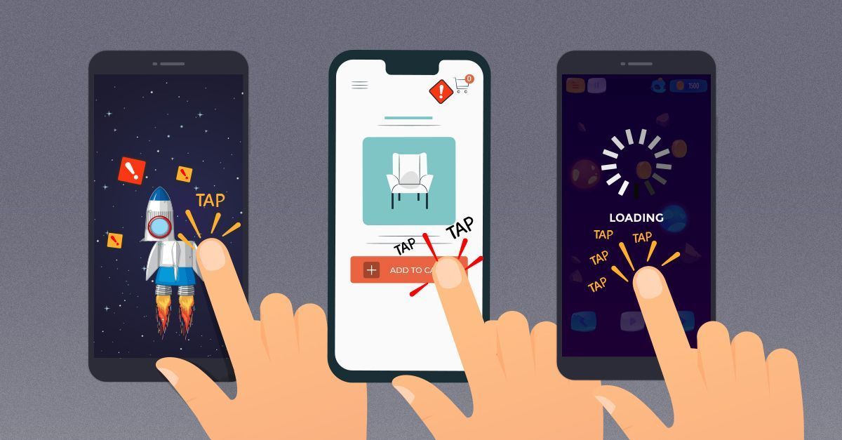
Practical guidelines to prevent rage taps and rage clicks with accessible tap targets for icons, links and buttons — on desktop and on mobile. With useful techniques and guidelines.Rage taps are annoying and frustrating. These wonderful occurrences in our interface when we need to tap twice or sometimes three times to continue our journeys. Of course, sometimes they happen because the website is too slow, but sometimes it’s the target size of interactive elements that is the culprit. So how big should our interactive elements be these days? What would be a reliable size for icons, links and buttons — in navigation and on mobile? How do we make it more difficult for our users to make mistakes? Let’s take a look. Note: You can find a whole video chapter on designing for touch in Smart Interface Design Patterns as well — along with 30 other chapters all around UX and design patterns. Target Sizes Cheatsheet One of the common recommendations for target sizes on mobile is 44×44px. This is a little bit misleading because screen pixels, or at least device-independent pixels (dips) are scaled to a multiple of the display resolution. So pixels are different on different screens, and
Related Posts
As SNAP Delays Continue, 10 Ways to Face Food Prices – Civil Eats
Catholic conference on mental health: Dignity is antedote to isolation – Vatican News
‘Let’s tackle that classic Donald Duck butt’: Fitness creator breaks down the 3 most common posture mistakes; expert-backed fixes that work – The Indian Express
D1 Training, Premier Athletic Fitness Brand Expands to Toledo – citybiz
tips and best practices when writing a long-form article

16 Great Examples of Welcome Emails for New Customers [Templates]

5 Ways Offshore Wind Can Boost North Carolina’s Economy

Pop Up in An Empty Lot